top of page
Illustrator, Writer, and Reader
Click on each illustration to learn more about my thought process behind them!

"Alice In Wonderland"
by Lewis Carroll
Illustrated and Designed by Carolyn Marie Wellstead (Maiden name: Castagna)
(oil on board, with digital elements)
For this cover, I wanted to compose an eye catching piece that would do justice to Lewis Carroll's extraordinarily bizarre narrative.
I was inspired by the scene found in chapter 8, when the three playing cards are painting the Red Queen's white roses red.
I thought, 'What if the White Rabbit wasn't white but red?' Putting this spin on a very classic tale sent my imagination soaring, and I hope it does the same for you the viewer/reader.
This illustration/design and I had the incredible honor of winning 1st place in the Society of Illustrators student scholarship competition in 2021.

"Anne of Green Gables"
by L. M. Montgomery
Illustrated, Designed, and Embriodered by Carolyn Marie Wellstead
(embroidery on cotton, with added digital elements)
I chose to fully embroider this design, because I wanted the book jacket to feel like Anne Shirley herself made it for each reader. As well as for it to capture her dreamy essence.
Each element of the design is part of her story and shows signs of the wildness of her nature.
My hope, was to make this feel less like a book from the 21st century, and more like an actual item or prop found in the story itself. This way, each reader can feel like they truly have a friend in Anne, or should I say, "kindred spirit."

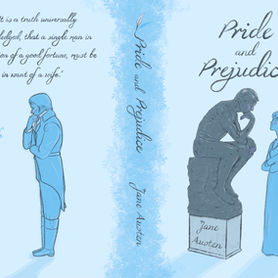
"Pride and Prejudice"
by Jane Austen
Illustrated and Designed by Carolyn Marie Wellstead
(digital media, with graphite portraits added)
"Life imitates art," was the saying that inspired this series of book jacket designs for two of Jane Austen's novels. It was coined, not by Jane Austen, but by Oscar Wilde.
I used a monochrome color pallet and a work of classical art, in this case Rodin's sculpture of "The Thinker," to capture the atmosphere and narrative of the well beloved "Pride and Prejudice."
Each french flap also features a graphite portrait of the author and main character, with their individual clever character descriptions.
In Lady Catherine de Bourgh's opinion, Elizabeth Bennet is an "obstinate, headstrong girl!" Who, on the cover, is looking directly into the eye's of "The Thinker," the symbol of Mr. Darcy. I chose to have this particular sculpture symbolize Mr. Darcy because of his thoughtful and strong nature. The image of Darcy, in a similarly pensive pose, is reflected on the back cover to emphasize this. As well as his thoughts of "wanting a wife."
Life does indeed imitate art as well as literature.

"Emma"
by Jane Austen
Illustrated and Designed by Carolyn Marie Wellstead
(digital media, with graphite portraits added)
"Life imitates art," was the saying that inspired this series of book jacket designs for two of Jane Austen's novels. It was coined, not by Jane Austen, but by Oscar Wilde.
I used a monochrome color pallet and a work of classical art, in this case Antonio Canova's sculpture of "Cupid and Psyche," to capture the mood and narrative of the hilariously heartfelt story of "Emma."
Each french flap also features a graphite portrait of the author and main character, with their individual witty character descriptions.
Emma is the "cupid" of her social circle, always needing to make matches, and never wanting a love of her own. Little does she know, the watchful and caring Mr. Knightley, reflected on the back cover, may be the exception. Emma's arrow, unbeknownst to her, may have struck her own heart. Symbolized through the story of Cupid and Psyche, Emma and Knightley gaze at the sculpture and each other.
I wanted to capture the subtleties of their feelings for one another, while also expressing the humor of the story.
I hope to continue this series using other colors and works of art to provide new and old Jane Austen fans with a rainbow of her colorful characters.
Life does indeed imitate art as well as literature.

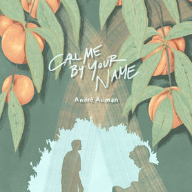
"Call Me By Your Name"
by Andre Aciman
Illustrated and Designed by Carolyn Marie Wellstead
(digital media)
While reading this story, the poetic descriptions of the Italian setting were being painted in my mind. Each word I read felt like another brushstroke, and the end result is this illustration.
Using a limited color pallet, while mixing warm and cool tones, I wanted to express the mood and suggest the setting of the story to invite the viewer/reader in. This is a very gentle yet passionate story, which I wished to capture in this design.
The two light orange brush strokes that intersect under the title were meant to represent the two main character's paths crossing.
By composing it this way, I hoped to suggest where the narrative leads.

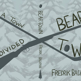
"Beartown"
by Fredrik Backman
Illustrated and Designed by Carolyn Marie Wellstead
(digital media)
"Beartown" begins, "Late one evening toward the end of March, a teenager picked up a double-barrelled shotgun, walked into the forest, put the gun to someone else's forehead and pulled the trigger."
What a way to start a story!
"Beartown" is about a small remote Swedish town being divided after a violent act takes place. Causing turmoil between the people and the one thing that keeps them all together, the hockey team.
I wanted this book design to work in a special way. By looking at the front cover only, the viewer/reader will be able to distinguish the hockey stick and puck. It is only when they look at the back cover that it will become clear that the other stick-like silhouette isn't another hockey stick, but the exact double-barrelled shotgun mentioned in the first sentence.
I divided the composition using these two shapes to illustrate the divide that takes place in the novel.
By using a monochrome grey blue color scheme, as well as the background of snow covered trees, I hoped to express the cold harshness of the story and Fredrik Backman's powerful narrative.

"Jane Eyre"
by Charlotte Bronte
Illustrated and Designed by Carolyn Marie Wellstead
(digital media)
"Jane Eyre" is a book that has captured the hearts of millions, including mine. It's full of some of the most powerful symbolism in Victorian literature.
I have a great love for textiles, and wanted to compose this piece as if it were the wallpaper at Thornfield Hall, the main setting of the novel.
I had the idea to illustrate the famous quote, "I am no bird; and no net ensnares me..." using a visual narrative.
The white dove represents Jane and her purity. The caged red bird represents Bertha and her imprisonment.
Jane, the dove, isn't caged, but she is tied with a string to her narrative and to Mr. Rochester. Just as he confesses, "As if I had a string somewhere under my left ribs, tightly knotted to a similar string in you."
The broken and birdless cage foreshadows later events in the story.
Finally, the title "Jane Eyre" is caught in the branches of the tree to also symbolize how Mr. Rochester weaves himself into Jane's life. Jane, in essence, is stuck in his branches.
bottom of page